
About the project
The New York Public Library (NYPL) with the mission “To inspire lifelong learning, advance knowledge, and strengthen our communities”, has been serving for over a century. It has 88 neighborhood branches, four scholarly centers, 51 million individual informative items and over 93,000 annual programs for all age groups; catering to over 18 million patrons a year and millions more online.
Team Members
Aimen Awan, Margaret Daly, Kimie Ouyang
My Role
My major contributions were in the areas of user research, ideation sessions, wireframing, interface design, interaction design, and prototype evaluation.
Tools
Optimal Workshop, Adobe Photoshop, Sketch, Flinto
The design process

Goals
-
Design navigation, vital to mobile users
-
Identify differences in needs between mobile and desktop experiences.
-
Examine organizational and mobile patterns that make the site easy and enjoyable.
-
Test & explore labels with strong, common associations and areas where the overlap is large enough to defeat and confuse patrons.
DISCOVERY PHASE

Stakeholder Interview
Sharon Denning
Director of UX and Design at the New York Public Library
Important takeaways from the interview were:
-
Cost of exploration is high when you get somewhere on the website because it’s hard to recover.
-
The research has been quantitative — inside a room among the library professionals rather than by talking to actual users.
-
Librarians spend time telling people how to locate stuff on the website.
-
Currently, the library does not have its own mobile application.


Insights
-
Users seem to desire personalized navigation and avoid conventional navigation.
-
People don’t want to navigate in a hierarchical structure.
-
Social media-like parsing might motivate users to try conventional navigation.
-
Users see authenticity as one of the key factors when searching for information.

Personas
PLAN & FRAME PHASE

KPIs
To validate our design solution, we finalized our Key Performance Indicators. The objective was to have satisfied users on all devices.
-
More people accessing the web on mobile
-
More people interacting with the navigation
-
Fewer clicks to perform an action
-
More time spent on each page
After brainstorming through a few ideas, we finalized three features and evaluated them on user impact and technical feasibility.

Card Sorting
Tool: Optimal Workshop
Participants: 30
Cards: 57
Categories Identified: 107
-
The Participant-centric Analysis shows overlap that will require additional review.
-
The contents of the categories reflect a common understanding of the category names.
-
The extensive overlap of categories suggests that we need to find a way to associate categories and ensure users can explore categories without being infinitely derailed.
-
Labeling opportunities exist for greater user engagement.
From the results of our card sorting activity, we created our first information architecture diagram

Check-in Presentation with Stakeholder
At this point, we presented our progress to the stakeholder. They appreciated the effort but pointed out two major challenges for us:
-
There was a business requirement to add a prominent Donate button.
-
Information architecture was too complicated in their opinion.
Create & Iterate

Competitive Analysis
Based on relevance to our project, I selected three websites for competitive analysis: The Seattle Public Library, Evanston Public Library, and Walker Art Center

After doing a thorough competitive analysis, and stakeholder review, we revised our information architecture to simplify it.

Wireframes
Wireframes were created on the basis of insights from interviews, observations and card sorting.
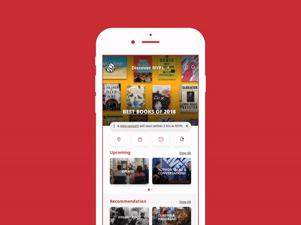
Four features were designed:
-
Discover menu
-
Notifications
-
Utilities
-
What’s Happening Now

Prototype Evaluation

User Testing
Participants: 6
Aged: 20 - 60
Students: 2
Professionals: 4
Retired: 2
-
Users struggled with the global menu and were not able to understand the “Discover NYPL” label.
-
Labels on the global menu got mixed reviews. “Interest me by” was very confusing.
-
Users found “What’s Happening Now” (WHN) very engaging but they want an easy exit out of that section.
-
Better icons can be used at some places for example users assumed that location icon will only tell their current location and not the location of libraries


Presenting our design solution to NYPL’s Design Team
Future Direction
User interviews and observations were helpful to get us started. They gave us a sense of the objectives of our design. We set our goals so as to alleviate the most frequent and taxing problems that our users were going to face, while also meeting the needs of the stakeholder. We learned how to use card sorting to come up with grouping and labeling that our users found natural, independent of our own bias. Low fidelity prototypes were helpful to give our users an early look at our design. Feedback at this early stage was crucial to fixing issues with our approach and determining the direction of our future design. We learned how to better understand the needs of our users through this project. We followed the entire user-centered design lifecycle, from research to prototype.